
Microsoft’s Core Fonts for the Web
From 1996 to 2002, Microsoft made a collection of fonts it called "Core Fonts for the Web" available for free to anyone who wanted to download them (they were included on Windows, of course).
Why? The company wanted there to be a standard set of fonts that web developers could count on in their work. By & large, that objective was met, & even though Microsoft officially ended the program a decade ago, those fonts are still included in Windows and on all Macs, and are still legally available all over the Web (in fact, a survey on the Ubuntu Forums indicates that over 75% of Ubuntu users have the Core Fonts installed; Ubuntu, for those who don't know, is the most widely used desktop variant of Linux).
Now let's briefly look at those fonts.
Andalé Mono
Type: Monospace
Width: Narrow
Should you use it? Sure
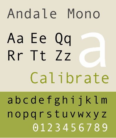
Andalé Mono (pronounced an-delay) is a pretty good monospaced font, & it used to be my favorite for coding. In particular, Andalé Mono does a great job distinguishing between zero & capital O, & the capital I, the lowercase l, & the number one. However, Microsoft no longer distributes it on Windows (although it still comes with Mac OS X), & instead promotes Lucida Console as its replacement.
Arial
Type: Sans serif
Width: Narrow
Should you use it? Try to avoid
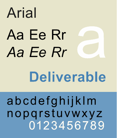
Arial isn't a horrible font—it's just boring & overused ("generic" & "bland" are used to describe it). It's also, interestingly, a ripoff of Helvetica, one of the best fonts ever made1. Basically, Microsoft didn't want to license Helvetica, so instead it licensed the far cheaper Arial, a poor copy of a far better font2. For years it was the default header font in Word (although that's finally ended since Office 2007), which meant that it was already overexposed before it started popping up on millions of websites. If you must use it, place it next to last in your CSS font stacks, as a fallback before you finally give up with the generic sans-serif. And please put Helvetica ahead of it, so those of us with decent fonts can enjoy that instead.
Comic Sans
Type: Cursive
Width: Who cares?
Should you use it? Not if you want to get any respect
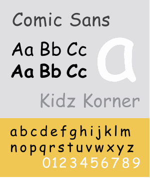
Widely derided as one of the worst fonts ever made, you should never use Comic Sans on the Web. Or in print. Or in anything, ever. It's a ugly, stupid, crappy font that makes anything it touches look ugly, stupid, & crappy as well. Do not use Comic Sans or you will lose my love & that of your parents & friends.
Courier New
Type: Monospace
Width: Wide
Should you use it? Not if Andale Mono is available
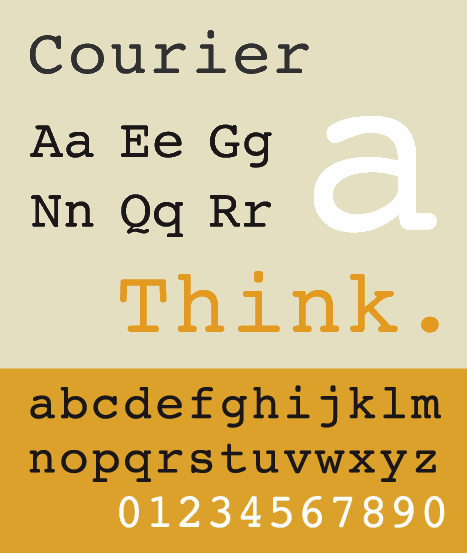
Courier New is designed to look like a typewriter. Whoop de doo. It's also a poor copy of the much better (& classic!) Courier.
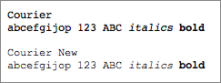
Image from Daring Fireball
Boring, unimaginative, & with no good differentiation between easily-confused characters (see Andale Mono above, which does a great job at this), Courier New should never be anyone's first choice for a monospaced font. Since it's on so many computers, I guess it's acceptable—barely—to use at the bottom end of a CSS font stack, like this: "Andale Mono", Courier, Courier New, monospace.
Georgia
Type: Serif
Width: Wide
Should you use it? Sure
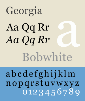
Georgia a serif font designed to be read on screen, not on paper. As such, it's wide, legible, and attractive. Note that I said "attractive", not gorgeous—it's not a font that takes your breath away, but it is one that's easy to stare at for hours. You can use it as a body font, but I wouldn't (I vastly prefer sans-serif fonts for that); instead, I'd feel free to use it as a header font.
Impact
Type: Slab serif
Width: Narrow
Should you use it? Very sparingly
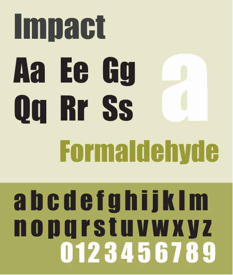
Impact is a heavy, slab serif font that is designed to, well, make an impact. As such, it should be used rarely & in short bursts. Not for headers (well, I guess on the right website it'd be OK for headers), but for special occasions.
Times New Roman 3
Type: Serif
Width: Narrow
Should you use it? No
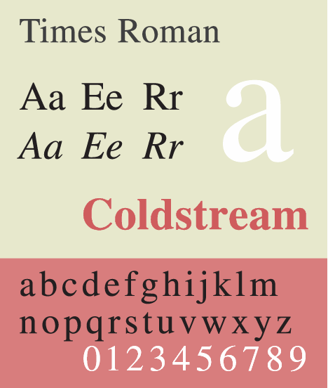
Microsoft made Times New Roman the default body font in Word (although that's changed since Office 2007), guaranteeing that millions upon millions of users had to look at it all day on printouts. To be honest, back then that wasn't awful, since the font was designed for print4. The problem was that Microsoft in its pin-headed brilliance made it the default font in Internet Explorer, which was a terrible decision. Times New Roman might look fine in print, but it looks like utter crapola on screen, being too thin & wispy to work well in that media. And even if it didn't look awful on a computer monitor, it's still ridiculously overexposed, like a rapper that guests on 5 of the top 10 current hits. Do not use Times New Roman on your websites.
Trebuchet MS
Type: Sans serif
Width: Narrow
Should you use it? Sure, with caveats
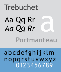
Trebuchet (pronounced treb-oo-shet, & named for a medieval catapault) is a sans-serif font with a bit of class about it. It looks nice, & if you want to use it as a body font, or as a header (but not both at the same time!), go right ahead. I only have one complaint about Trebuchet MS, & it keeps me from using it on my sites: I dislike, no, I hate … no, I absolutely loathe to the center of my being its ampersand character. If the devil himself were designing ampersands that he wished to use in order to pollute the earth, the ampersand in Trebuchet MS is what he would create. And here it is:

Vile & disgusting5. And now I will go wash myself.
Verdana
Type: Sans serif
Width: Wide
Should you use it? Yes
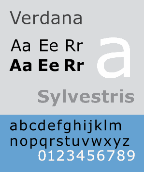
Verdana is a font that was designed for screen reading6, & it does a great job at that. If you want to use it high up on your CSS font stack, even first in the list, go right ahead—around 99% of Windows & Mac computers have it on them, & almost 70% of Linux boxes. In fact, I usually change my web browser's font prefs to make Verdana the default (if Candara isn't available; see more below), & my eyes always appreciate it.
Webdings
Type: Wingdings
Width: N/A
Should you use it? Uhhhh…
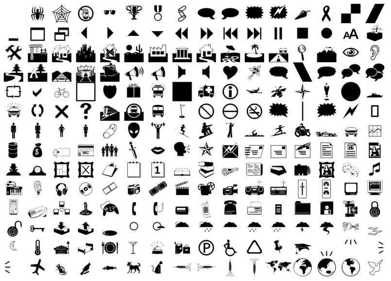
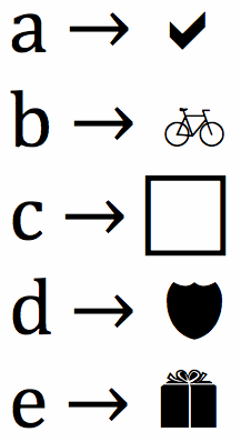
Want to insert little pictures into your document when you press letters on your keyboard? In other words, press these letters & output these shapes?
Then you want a font that falls into a special category called dingbats. You will not use these often, but when you need them, they're nice to have. And, I have to admit, they're fun. Webdings is a dingbat font, & it has some fun characters in it, as you can see. One really nice thing about it: most of its characters don't have Unicode equivalents, so these are the only place you can easily get some of these images. Just don't go nuts with the dingbat fonts & litter your webpages with them. Show some restraint!
Microsoft’s ClearType Font Collection
Introduced with Windows Vista, Office 2007 for Windows, & Office 2008 for Mac OS X.
Calibri
Type: Sans serif
Width: Narrow
Should you use it? Sure

Starting in Office 2007, Microsoft replaced the default body font Times New Roman with Calibri, meaning that it's now familiar to millions of people all over the world. I don't prefer it for body text on websites (instead, I'd look at Corbel or Candara—or even good ol' Verdana!—for that), but it's not terrible. If you're looking for a sans-serif for headers (because you're using serifs for the body), Calibri would be a good choice.
Cambria
Type: Serif
Width: Wide
Should you use it? Sure

Not a bad serif font. At least it's a heck of a lot more readable on screen than Times New Roman. In particular, it's nice for business-y sites. By default, this is the new header font in Microsoft Office 2007 & up.
Candara
Type: Sans serif
Width: Wide
Should you use it? Sure
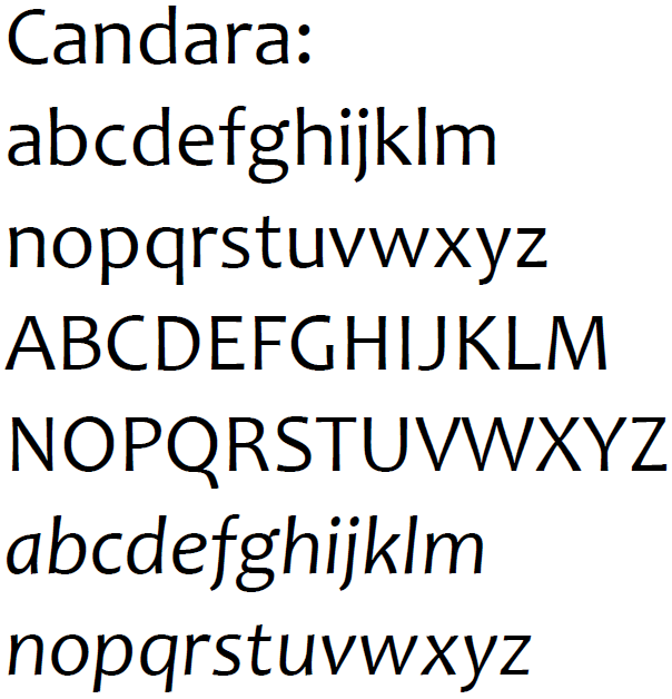
Candara has some very interesting design choices in it, including, as Wikipedia points out: "both entasis and ekstasis on opposite sides of stems, high-branching arcades in the lowercase, large apertures in all open forms, and unique ogee curves on diagonals." Candara is a sort of replacement for Verdana, but I still prefer Verdana, although Candara will work if you want something fresher & more stylish.
Consolas
Type: Monospace
Width: Wide
Should you use it? Sure
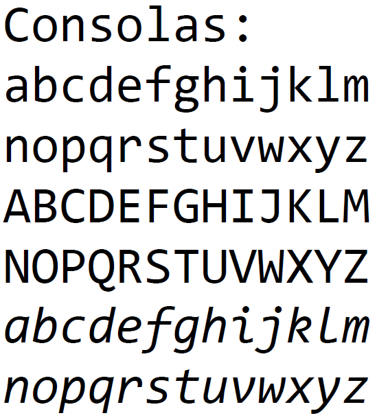
Since Andalé Mono is no longer included with Windows, Consolas is now the best monospaced font for coding that comes with Windows (sure, you can always search out others & install them, but I'm only talking about those that are already installed with Windows7). For instance, the zero actually has a slash through it so you can tell it apart from the capital O, & it's easy to tell the number one & the small letter l apart. Use Consolas instead of Courier New if you can.
Constantia
Type: Serif
Width: Wide
Should you use it? Sure
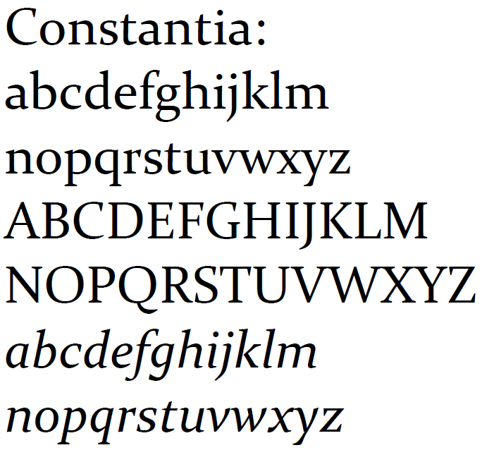
It's not a bad serif font at all; it just doesn't do much for me (although others really dig it). Give it a whirl. And keep in mind that Constantia was designed for both screens and print, so feel free to use it in both contexts.
Corbel
Type: Sans serif
Width: Wide
Should you use it? Sure
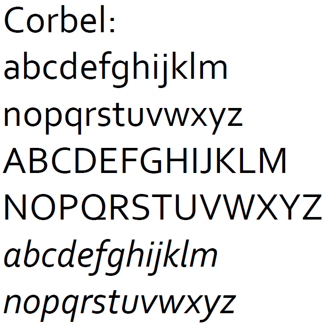
Corbel is a pretty nice sans-serif font, but it's no Frutiger, which it copies closely. In particular, the numbers in Corbel are nicely done. Use this instead of Trebuchet or Arial (please!).
-
For a nice visual primer about how to tell the difference between Arial & Helvetica (& Grotesque), take a look at "How to Spot Arial". ↩
-
For the whole sorry story, see "The Scourge of Arial". To summarize: "Arial gets chosen because it’s cheap, not because it’s a great typeface". ↩
-
Note that Times Roman is not the same as Times New Roman, although the two fonts are very similar. ↩
-
How much was Times New Roman designed for print? It was actually developed in 1931 for The Times of London newspaper. Doesn't get more print focused than that! ↩
-
There is a good historical reason for the Trebuchet ampersand. It still sucks. ↩
-
According to Wikipedia, you can tell it was designed for the screen by its "lack of serifs, large x-height, wide proportions, loose letter-spacing, large counters, and emphasized distinctions between similarly-shaped characters". ↩
-
If you use a newer version of the Mac editor BBEdit, you're probably using Consolas, as the company that makes BBEdit licensed the font for inclusion with the program. ↩