On this page…
This is the text of a talk I gave at the BJC conference, "Learning on the Edge … the River's Edge", on 24 September 2003. It’s here for historical reasons.
Hello, and good afternoon. My name is Scott Granneman, and I'm here today to talk about a subject that has been my primary professional and personal focus for almost a decade: Web sites.
Let me first give you a little background about me. I'm an instructor at Washington University in the areas of technology and Web development and at Florissant Valley Community College in the subjects of Web development and the Linux operating system. I'm a consultant with Bryan Consulting, where we work with small and medium-sized businesses and non-profits to improve their technology usage, especially in the area of Web site development and hosting. And finally, I'm an author. I write columns for Security Focus, the largest IT Web site devoted to security, and I'm writing a book for Apress Books in San Francisco about open source software. As you can tell, I'm a busy technologist, and I'm proud of it.
I'm going to talk today about four things:
- The most important thing in Web development
- Web Site Must-Have's
- Web Site Probably-Not's
- Content Management Systems
The Most Important Thing
The name of this talk is 'You Deserve Full Value from Your Web Sites' … and you do! So I'd first like to talk about the most vital action that you absolutely must take if you wish to create and run a successful Web site.
The most important thing when designing a Web site is pretty simple, actually, but it's amazing how many organizations never bother to do it, or if they do engage in it, they do it ineffectively. I'm talking about planning.
Make sure that you plan everything you wish to accomplish with a Web site, and make sure than anyone you work with on the Web site, whether inside or outside your organization, has a defined process for the work they want to do. Think of your Web site like you would a business. When you start a business, you should have a business plan; in the same way, you should have a Web site development plan.
One of the biggest parts of your planning should encompass something called 'Information Architecture.' It's one of the most important yet most often overlooked aspects of Web development. Basically, it's the study of how best to organize information so that Web site users can find it, or, as one speaker once put it, 'How can you make it easy for your site visitors to find all of your fantastic content?'
Many of the people I speak to know how to architect information for television, or radio, or print, but the Web is different. Unlike those other media, a Web site is a living, dynamic creation, and you need to plan and document its creation and growth, in the same way you would if you were building a new wing for a hospital. Even the best Web site in the world becomes a jumbled mess if you haven't figured out what you're doing with it first.
Remember the cardinal purpose of Web sites: users come to your Web sites to get something (information or software or a PDF) or do something (subscribe to your newsletter, or donate to your cause, or buy your book). Anything that delays the user's attempts to get or do something only serves to increase the likelihood that she will leave. Anything that blocks or frustrates the user's attempts to get or do something guarantees that she will leave. Make things easy for your users, and they will use your site, and thereby strengthen the relationship between your organization and your users.
Additional resources
Much of what I discuss in this section and in other sections in this document is amplified and deepened at the website of my company, WebSanity, a local firm that does Web consulting. I encourage everyone to spend some time on the WebSanity site, as it has a wealth of information on it. You can find it at http://www.websanity.com.
For more information about information architecture, see http://www.jjg.net/ia, which offers an enormous collection of resources on the subject.
To get the ball rolling, ask yourselves these questions (there are more, but these are a good start):
1. Why do we want (or need … those may be two different things!) a Web site?
2. If we had a Web site previously, what did it do well? What did it fail to do well?
3. What are our competitors doing on the Web? What can we emulate? What should we avoid?
4. How can we use our Web site to solve a problem or capture an opportunity?
5. How can we use our Web site to make money, or save money?
6. Who's going to be providing content for the initial rollout of the Web site? Who's going to provide content after that? Who's going to place the content on the Web site?
7. Who are our audiences for the Web site? Do they all need or expect the same information? What information do all visitors need?
It all comes down to planning. Plan and research your needs, your probable content, your audiences, and your content creators & maintainers. Good planning makes or breaks a Web site.
Must-Have's
Now that we know the most important thing you need to do when creating your Web site, I'd like to get into the nitty-gritty and talk about some of the things that you really should have on your Web site. Think of these as features that are must-have's.
Your logo
Your logo should be on every page on your site. It shouldn't be too big, because then it dominates everything. You want a gentle reminder, not a club over the head. As an additional bonus, your logo should link back to your home page. A lot of people won't look for that, but some will, and it's a nice feature to include.
The 'Footer'
My partners at Bryan Consulting and I call this chunk of copy that goes at the bottom of every page on the site the 'Footer'. Here's what one looks like from the Public Relations Society of America, St. Louis chapter:

Notice what the Footer contains. On the bottom is the contact information for your organization: snail mail (yes, people still use snail mail) and phone number (yes, people still use the telephone). If you've got a general email address, such as an 'info@', then include that as well. It's important to make it easy for people to find out how to contact your organization, and a link to a 'Contact' page, which also essential, just isn't enough.
Above the contact information, we include a link to the site's privacy policy, which is always important to include, the copyright statement, and a link to what we call 'About This Site'. 'About This Site' allows us a small area to brag on the organization who owns the Web site, and explain Bryan Consulting's part in the process. Overall, the footer is small but very powerful.
Search
Search is incredibly important, because it enables your users to find content on your site that isn't always easily found. However, studies have shown that people often don't use search effectively. In other words, users will, if it's strongly emphasized, immediately use search to try to find things, and then, when search doesn't work because their search terms aren't well chosen, they give up and leave the site. In other words, search should be available as a tool, but it should be de-emphasized so it's not your main navigation tool. On our sites, we provide a link to Search on every page, as at the National Conference for Community & Justice site, but we don't provide a search box.

By the way: all rules were meant to be broken. If your site is small, with only a handful of pages, then don't include search at all. It will just get in the way.
Site map
A site map is an outline of every page on your Web site, conveniently presented on one Web page. Here's an example from Butterfield Youth Services, which runs several homes for troubled kids:
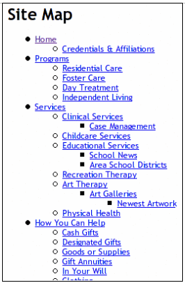
A site map is a powerful tool for users of your site. With it, they can find exactly the content they were looking for, and can be there with just a click. Unfortunately, site maps can be a real pain to maintain manually. Every time you create a new Web page, you've got to head over to the Site Map page and add a link to the new page. It's much easier if you can automate the process, so that new pages are automatically added to the Site Map without any extra work on your part. In just a minute I'm going to be discussing a way to do just that.
By the way, notice in the illustration above for NCCJ that the link to the Site Map goes next to the link for Search. It's available on any page if your users need it, and trust me, many folks will definitely take advantage of it.
Print This Page
We've all been at a big Web site, like the New York Times or the Post-Dispatch, and wanted to print the page we're viewing. Most pages, however, have a lot of pictures and navigation buttons and other stuff on them that we don't need to print. As a courtesy to their users, most big sites provide a link titled something like 'Print This Page' that presents users with a simplified, text-only version of the Web page, suitable for printing. Here's one example from the Beyond Housing Neighborhood Housing Services site here in St. Louis:

Again, you don't want to do this manually; instead, try to automate the process. After all, that's what computers are good for: the boring, tedious stuff that drives humans crazy.
Email This Page
You'll notice above that there is a button next to Print This Page that says, 'Email This Page.' If you've got content that you want people to share, then include a link on every page that will email the content. This requires some backend work for your Web developers, but it can really pay off. Now, your site visitors become site marketers as well, spreading your organization's name and content all over the world.
Web Sites offering Email This Page and Print This Page
Lots of Web sites provide these two features. Here are four that do it well.
- ACLU. http://www.aclu.org An issues-oriented site that works hard to get the word out.
- BBC News. http://news.bbc.co.uk Always tasteful & helpful.
- The New York Times. http://www.nytimes.com The Grey Lady makes it easy. For aggregated results, see http://www.nytimes.com/gst/pop_top.html
- Yahoo! News. http://news.yahoo.com/ The pioneer in these techniques still does an excellent job. Pioneered aggregated results as well.
Problematic Web Sites
These Web sites don't offer these two features, or do so problematically.
- Washington University. http://www.wustl.edu Some pages do, some don't. That's because there's no centralization.
- Ascension Health. http://www.ascensionhealth.org So much great content, but no way to easily pass it along.
RSS feeds for news & updates
This one is a bit harder to explain, but it's an important concept that you really should consider for your Web site, as this technology is definitely one that will only grow in importance in the coming years. Let's say that you post some news items on your Web site. Something new and interesting has happened within your organization, and you want people to know about it. Once you post a couple of short news items, your home page may start to look like that of Butterfield Youth Services, or BYS:
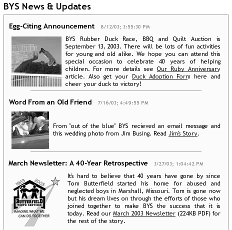
Now, if people know that your site posts regular updates, they will presumably come back to your site often to see what has updated. A lot of people will do just that. Unfortunately, a lot of people will not. They're simply too busy and there are too many sites that engage their interest. A new technology called RSS, or Really Simple Syndication, aims to change that.
If your server is set up to support RSS, then every time you post a fresh news item, that item gets added to your Web site's RSS file. Folks subscribe to your RSS file using software called a 'news aggregator' or 'RSS aggregator'. Every hour, the news aggregator checks any RSS feeds to which you have subscribed. If there are any updates to report, the aggregator grabs them and displays them. If there aren't any updates, then the aggregator does nothing for another hour, when it checks once again.
I use a news aggregator named 'Radio' made by UserLand, a company that helped pioneer RSS and news aggregation. My page of collected RSS feeds looks like this:
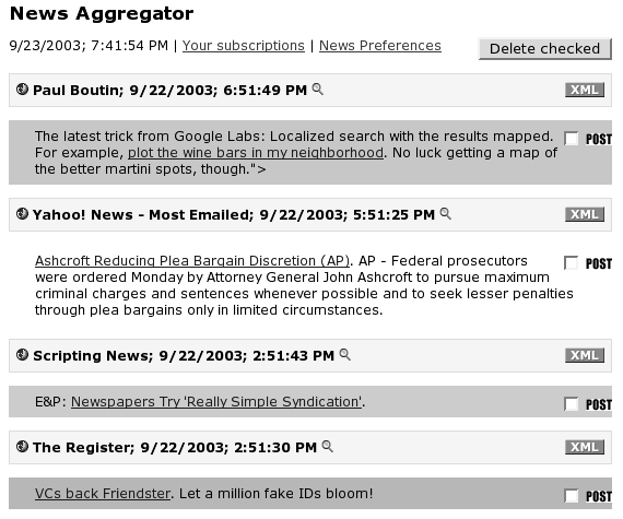
It's really easy to set up a news aggregator, and more and more Web sites are catering to the people using this new software by setting up RSS feeds. Ideally, your server automates the whole RSS creation process. Trust me: you don't want to have to set up a RSS feed manually. As more and more people 'lose' emails in a sea of spam and email from friends and family, RSS is starting to look more attractive to organizations that want to get the word out in an effective, useful way.
RSS Aggregators
I encourage you to try out an RSS aggregator for yourself. Here are a few that I recommend.
- Radio UserLand. http://radio.userland.com. Free for 30 days; $39.95 per year. Mac and Windows.
- NetNewsWire. http://ranchero.com/netnewswire/. Free for 30 days; $39.95. Mac OS X.
- AmphetaDesk. http://www.disobey.com/amphetadesk/. Free. Mac, Windows, & Linux.
- FeedDemon. http://www.feeddemon.com/. Free now; $29.95 in future. Windows.
- NewsGator. http://www.newsgator.com. $29.95. Windows (requires Outlook).
To find RSS feeds that you can subscribe to, use these search engines or lists specifically targeted to RSS:
- Syndic8. http://www.syndic8.com/
- NewsIsFree. http://www.newsisfree.com/
- Moreover. http://w.moreover.com/categories/category_list.html
- WebReference. http://www.webreference.com/services/news/
Web Site Probably-Not's
I've talked about things that a good Web site should have. Now I want to discuss a couple of things that your Web site probably should not have. Notice that I said 'probably'—as I said, rules are meant to be broken, so you may have just the perfect situation that requires some of the following items. But I doubt it!
Frames
Ah, frames. Anyone who has used the Web for any length of time has experienced frames. Basically, frames are used for one or both of these reasons:
- To keep content on-screen at all times, like a logo or footer or navigation.
- To present two or more Web pages within one window at the same time, like a navigation windows and a content window.
Here's an example of a frames-driven Web site: the BJC Health site.
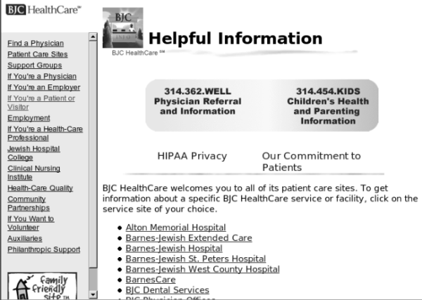
BJC uses frames in both of the ways I mentioned above. First, the BJC HealthCare logo is in a frame in the upper left corner, and it never leaves the screen. Second, the navigation is in its own frame on the left side of the screen, while the content is in the right-most frame.
The thinking behind all of these frames is well-intentioned, as they are designed to benefit both the organization and the Web site user. The constant presence of the logo, the thinking goes, serves to reinforce our brand across the Web site, keeping us continually in the user's mind, and thus benefiting BJC; while the navigation's continuity on the left side of the screen helps the visitor more easily navigate around the site without getting lost, thus benefiting the user.
Both of these assumptions are wrong.
Let's look at the logo issue first. Visitors to the site will not forget that they are at the BJC site. They do not need a logo in front of them at all times to know where they are. On top of that, remember: users do not come to a Web site to be branded; instead, they come to accomplish tasks. Simply place the logo at the top of the page, without a frame. Your visitors will see the logo when the page first loads, and while they are viewing content at the top of the page. When they scroll down, they are not going to immediately forget where they are. Keeping that space always available for the logo takes up valuable screen real estate that could be used for other purposes.
As for navigation, the same principle holds true. If your navigation is logically presented, it's OK for a site visitor to scroll down and no longer have that navigation right in front of his eyes. Look at Amazon.com, for instance, which is one of the most-visited sites on the Internet. The navigation is at the top of the screen, and pages tend to be very long and detailed. Yet visitors have no problem scrolling down to read, and then going back to the top to navigate elsewhere on the site.
Frames are not just unnecessary, however. They actually prove counterproductive by making a Web site harder to use instead of easier. Problems occur in three main areas:
- Navigation
- Bookmarking
- Printing
Navigation is harder because of the way frames are designed. Basically, a Web page using frames is not really one page: it's several. To create a Web page with frames, you first create a frameset, and that frameset defines where the frames will go, how big they will be, and what names they will have. So, for the BJC site, a frameset has been defined that looks something like this:

Frame 1 is named 'toplogo' and is actually a Web page that contains the BJC logo; frame 2 is named 'toc' (for Table of Contents) and is actually a Web page that contains the site navigation, and frame 3 is named 'main' and is actually a Web page that contains the page content of the Web site. All three frames sit inside another Web page, called the frameset, which is actually the Web page located at http://www.bjc.org. Notice as you click on the links in the navigation frame (#2) that the content in frame #3 changes, but the URL, or Web address, never does. In essence, you are always at http://www.bjc.org. You are changing pages, but not really, because you never leave http://www.bjc.org, unlike most other Web sites, where you might start at http://www.widgets.com/ and then proceed to http://www.widgets.com/contact.html and then finish up at http://www.widgets.com/products.html. But with frames, it's like what the Eagles sang in 'Hotel California': 'You can check out any time you like, but you can never leave.'
Since you never leave the frameset while you're visiting the Web pages inside a framed site, your Back button on your Web browser starts to act weird. Normally, you hit the back button, and you go back to the previous page. Inside a frameset, you go back to the previous frame. As a result, people can get confused when they're trying to back out of a frame site, and instead of leaving the site, they just flip through pages within the site. Confused site visitors are never a good thing.
Bookmarking is another problem, although modern Web browsers (Internet Explorer 5 and up, and Mozilla 1 and up, and Netscape 6 and up) have mostly fixed the problem … but not always. Again, it all goes back to the way frames are created. Normally, when you bookmark a Web page so that you can easily return to it later, you actually bookmark the exact location of the Web page: http://www.widgets.com/products.html, for instance. But with frames, remember that you never leave the frameset, so it doesn't matter how deep you've gone into a frames-based site, you're still always at http://www.bjc.org. So when you bookmark a page that it took twenty clicks of the mouse to get to, you're still just bookmarking the home page, located at http://www.bjc.org! Needless to say, this can be tremendously frustrating for your site visitors. As I said, most modern browsers have this fixed by working around it to try to remember the actual framed pages that you were at when you created the bookmark, but this is still at best a poor workaround, and it doesn't always operate correctly. Better just to avoid the issue entirely by avoiding frames.
Printing is an enormous problem with it comes to frames. Try this experiment: go to http://www.bjc.org, click on a link in the navigation frame, and then try to print. If you're using Internet Explorer, the following dialog box will open up:
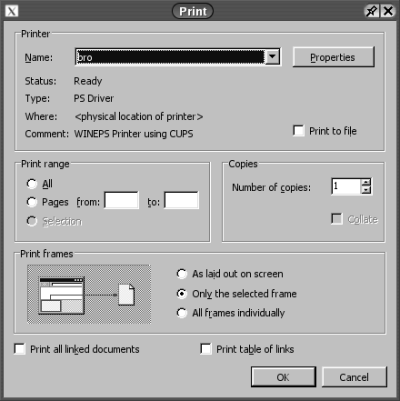
Notice that little section labeled 'Print frames'? Most people never even see it, even though they might have seen this dialog box hundreds of times. And therein lies the problem.
All modern Web browsers give users a choice when they try to print a framed Web page. Do you want to print everything just like you see it in your Web browser's window ('As laid out on screen'), do you want to print the last frame you clicked in ('Only the selected frame'), or do you want to print out each frame on a separate page ('All frames individually')? Notice the default: print the last frame you clicked in, or 'the selected frame.'
So what happens when a user comes to the BJC site? They navigate to a page they would like to print, so they click Print. Without reading the dialog box, they click OK. And what gets printed out? The navigation frame! Why? Because it's the selected frame, since it was the last frame they clicked in. So what happens next? They hit Print again, and again the navigation frame comes out of the printer. At this point, many people are going to give up, and remain unhappy that they could not print your site.
There are other problems with frames—they make Web development far more complicated, and search engines have a terrible time with them, for instance—but I think I've made my point clear. Frames are an outmoded and problematic solution that should be avoided at all costs.
Further information about frames
The seminal article critiquing frames remains Jakob Nielsen's 'Why Frames Suck (Most of the Time),' available at http://www.useit.com/alertbox/9612.html. It was written in 1996, but most of what he says still holds true.
'Why are frames so evil?' at http://www.html-faq.com/htmlframes/?FramesAreEvil brings a number of excellent points regarding the problematic nature of frames. It makes an excellent companion piece to Nielsen's commentary. 'Some Caveats with Using Frames' is quite similar and just as informative, and can be found at http://www.evolt.org/article/Some_Caveats_with_Using_Frames/22/293/index.html.
If you know your Cascading Style Sheets (CSS), then you know that you can use CSS to replicate the static nature of a frame by implementing position: fixed. Unfortunately, this is broken in Internet Explorer. A workaround is provided at http://devnull.tagsoup.com/fixed/, titled 'position: fixed fixed for IE/win,' or search Google for the phrase 'position: fixed' to find other solutions.
Finally, http://dorward.me.uk/www/frames/ is a Web page dedicated to 'Frames—The Problems And Solutions.' It provides links to discussions and solutions that offer solutions that work better than frames, based both on CSS and other technologies.
Flash
Macromedia has really been pushing a technology called Flash for the last several years. Basically, it provides animations on the Web, although Macromedia has been hard at work extending Flash so that it now connects to databases, creates forms, and does all sorts of neat tricks. Unfortunately, it really doesn't belong on most Web sites.
Most Web sites use Flash to either provide a splash page ('Welcome to Widgets, Inc.! Watch the pretty words zoom around for a minute and then we'll take you on into our Web site!') or site navigation. Both are almost always a big mistake.
Splash pages—Flash or otherwise—are a huge usability error. People hate splash pages! In fact, Jared Spool of User Interface Engineering said that after watching thousands of people in their labs, they no longer call them 'Flash splash pages'; instead, they call them 'click throughs.' Why? Because very, very, very few people watch them—instead, people look for the 'Click to skip' link and get past the Flash as quickly as possible. The example I always use is Wal-Mart—when you walk into Wal-Mart, the greeter doesn't make you stop and watch a 45-second-long movie about how cool Wal-Mart is. Nope. Wal-Mart gets it—they want to get you in the door as quickly as possible! So why are you delaying the entrance of people into your Web site?
As for Flash navigation, this is another error. There are easier, more effective ways to create navigation. Using Flash only complicates your navigation, both during creation and during use.
A lot of Web designers learn Flash, and suddenly everything has to be done with Flash. Resist the urge! The old saying is quite true: 'If you only tool is a hammer, every problem is a nail.' Not to mention, you will pay those Web developers a lot more money to create those neat-o Flash animations, and most of the time you will be decreasing the usability of your site instead of improving it.
Flash is good for representing information that needs to be animated because that's the best way to present that particular information. In other words, Flash is an excellent choice if you are working with information about any of the following:
- Processes (how to put together a bookshelf, or change a flat tire),
- Time (timelines, like 'Our Last 50 Years'), or
- Space (spatial layouts, or panning and zooming)
If you're using Flash for one of those purposes, it's an excellent tool; otherwise, it's eye-candy.
Further information about Flash
Jared Spool did a lot of research on Flash and user interaction. His results are available at http://world.std.com/~uieweb/flash.htm.
I wrote a couple of pages on my Web site about Flash. Some of my statements are no longer true as Flash has matured, but the general thrust of my remarks remains true. You can read my comments at Thoughts on Flash, What's Wrong with Flash?, and Clarification on Flash.
Content Management Systems
I've been building Web sites since 1995, and I've seen a lot of changes through the years. However, no matter what technology I've used, I've always had two goals in mind:
- Make it easy for Web designers and developers to create sites.
- Empower clients and 'normal' people who aren't Web designers and developers so that they can maintain and update their own sites.
Unfortunately, the second goal has proven a lot more difficult to realize than the first. Tools have gotten better over the years for Web developers, but it's still pretty hard for most 'normal' folks to change even simple things on their Web sites. As a result, Web sites get out-of-date and lose their currency. Content gets stale, and mistakes abound.
Why? Typically, because you have two groups involved internally with a Web site: communicators who create content and the technology people who place the content on the Web site. With two groups like that, you simply can't get things done in a timely fashion. You, the communicators, say, 'This content is really important, and it needs to get published today!' So you rush over to the techies and ask them to publish your stuff. They have a crashed server on their hands, however, and can't possibly get to it until tomorrow. The results? A missed opportunity.
Remember, you want site users, not site visitors. A visitor come to a Web site once and never comes back, or returns only sporadically, because there is nothing new there, nothing of changing value. A user, on the other hand, goes a Web site often, because there is something there of value to her, and it changes often enough that repeated returns are a necessity. I visit Jamaica; I don't use Jamaica, which is definitely unfortunate.
After a lot of research and thinking and playing with various software packages, I found a solution that meets both of my goals above—make it easy for Web developers, and empower non-techies—and that also helps transform visitors into users. Let me therefore suggest that you investigate a CMS, or Content Management System.
A CMS is a Web-based system that manages the content & design of your Web site. A knowledgeable person or company sets up the CMS for your Web site, including the templates containing your specific site's look and feel. Approved users can then add content to the site—including text, pictures, and extras like PDFs—or edit content that has already been placed on the site. Best of all, these users do not need to know any HTML. If they can type something in a word processor, they should be able to use a good CMS.
A CMS reduces the cost of development and, more importantly, the cost of maintenance. To understand why, let's look at the traditional method of developing Web sites using hand-coded HTML or a tool like Dreamweaver or FrontPage that hides the HTML.
If you develop a Web site using the traditional method, you end up developing many separate Web pages. If a Web site is 100 pages, you literally have to code 100 separate pages. This is a lot of work up front, and it can mean a lot of work later, if you want to change anything. For instance, if you decided to change the footer on every page, you'd have to change it 100 times, or use a global find and replace that doesn't always work as you'd expected. If you wanted to move the logo from the right side of the page to the left, again, you'd have to change it 100 times, or do a massive search and replace and that may or may not work right.
After the Web site is finished comes the big question: who's going to maintain and update the site? The company that created the Web site? A lot of Web design companies charge big bucks for maintenance contracts with their clients. Plus, there's always the inevitable delay when something needs to get changed.
OK, if not the Web design company, then how about someone in your company? Your IT guys? They're usually busy doing other things, so you can't always count on them to make the important updates you need right now.
Do you want someone to have to learn HTML? Or should they have to learn a program like Dreamweaver or FrontPage? (and should your organization have to buy those programs?) If they do use a program, realize that they have access to the content of the page they're working on, but they also have access to the design for that page as well. While they're fixing a spelling mistake or updating the calendar, they can easily remove the company logo or accidentally delete some of the page's navigation. And if only one person in your company can edit the site, then they become the bottleneck, and that's never a fun position to be in.
A CMS removes all of these issues because it's built using a database. Everything is stored in a database: the templates that govern your site's look and feel, the content that appears on your site, pictures, and even PDFs and Word documents. There are no Web pages; instead, when the CMS gets a request for the 'Contact' page, let's say, it …
- selects the template,
- grabs any appropriate content that is required for the 'Contact' page,
- accesses any pictures that go on the 'Contact' page,
- and then melds it all together to form the newly-constructed 'Contact' page,
… which the CMS sends out to the Web browser that originally made the request.
Since the Web site is built using customizable templates, it becomes easy to create the site. Instead of creating hundreds of pages, your designer creates one template. Better still, it becomes really easy to manage and change the site. If you want to change the site using the old, pre-CMS method, you have to change 100 pages. If you want to change a CMS-driven site, you change one template. Instead of hours or days, you're talking minutes.
Best of all, a good CMS provides non-technical folks with an easy tool they can use to edit Web pages. For instance, our system uses the following process.
- Approved user logs in to site with username and password.
- Logged-in user goes to Web page he wishes to change and clicks on an 'Edit This Page' button that only appears to logged-in users.
The page reloads, but the content is now in an editor similar to a word processor.
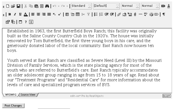
The user makes the changes and presses the 'Post Changes' button.
- The page reloads, with the changes now visible.
This process makes adding and editing pages incredibly easy. It's really amazing to me to watch people use a CMS, because all of a sudden they're Web creators as well as Web viewers, and that is truly empowering.
I firmly believe that most dynamic, content-rich Web sites will be built using a CMS of some sort in the future. It's the solution that makes the most sense for everyone involved in the Web development process.
Content Management Systems to investigate
You have a choice: buy or rent.
Purchased CMS solutions
- Vignette V7 Content Management Suite. http://www.vignette.com/ Enterprise solution: $200-250k+
- Microsoft CMS Server. http://www.microsoft.com/cmserver/ Upper Tier: $125-175k
- PaperThin CommonSpot Content Server. http://www.paperthin.com/ Mid-market: $40-100k
- Zope. http://www.zope.org/ Open source.
- Bricolage. http://bricolage.cc/ Open source.
Hosted CMS solution
WebSanity hosts CMS-driven Web sites for a variety of local and national clients.
- Saint Louis Zoo http://www.stlzoo.org
- National Conference for Community and Justice http://www.nccjstl.org
- Baptist State Convention of North Carolina http://www.bscnc.org
- Congregation of the Sisters of St. Joseph of Carondelet http://www.csjcarondelet.org
- Public Relations Society of America http://www.prsastlouis.org/
